With the introduction of themes in update 1.0 most of this guide is now redundant, but it will remain available in full just in case. The font asset guide will eventually be pulled into a separate guide.
This is part 3 of an in-depth guide to Songbird Editor. It covers modifying the looks of your game's interface.
Note: This guide only covers basic customization of the ready made interface of Songbird. It is possible to completely rebuild the game's interface with appropriate knowledge of Unity's UI system.
Note 2: Any changes made to your game that you want to persist should be done outside of play mode as upon exiting it Unity will revert any edits made while play mode is enabled.
Important: If you're planning on selling your game make sure you have the commercial rights to any images and fonts you're using.
- Basic concepts.
To modify Songbird's interface you will need to edit certain elements nested inside the Songbird Controller asset. To do this you will need to navigate through the controller's structure inside the Hierarchy window.
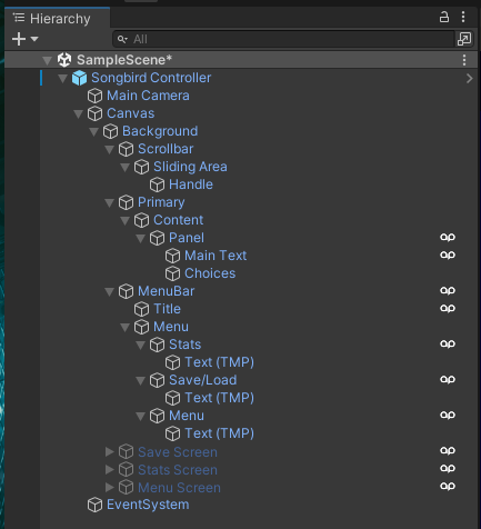
After finding the component you want to modify you can click on it once to open it in the inspector where you can preview and modify most aspects of that element.
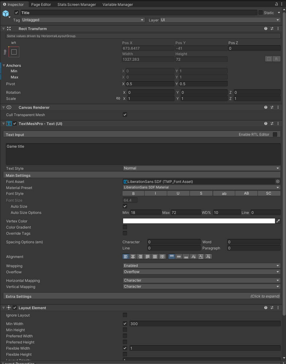
Alternatively you can also modify the prefab directly by opening it through the Project window, but doing so is not advised as those changes will be wiped out after an Update. Changes made to the controller inside Hierarchy will persist after an update.
Note: The exception to this is modifying the Choice Prefab as there is no reference to it inside Hierarchy. More information about this below in the choice buttons section.
- Customizing text
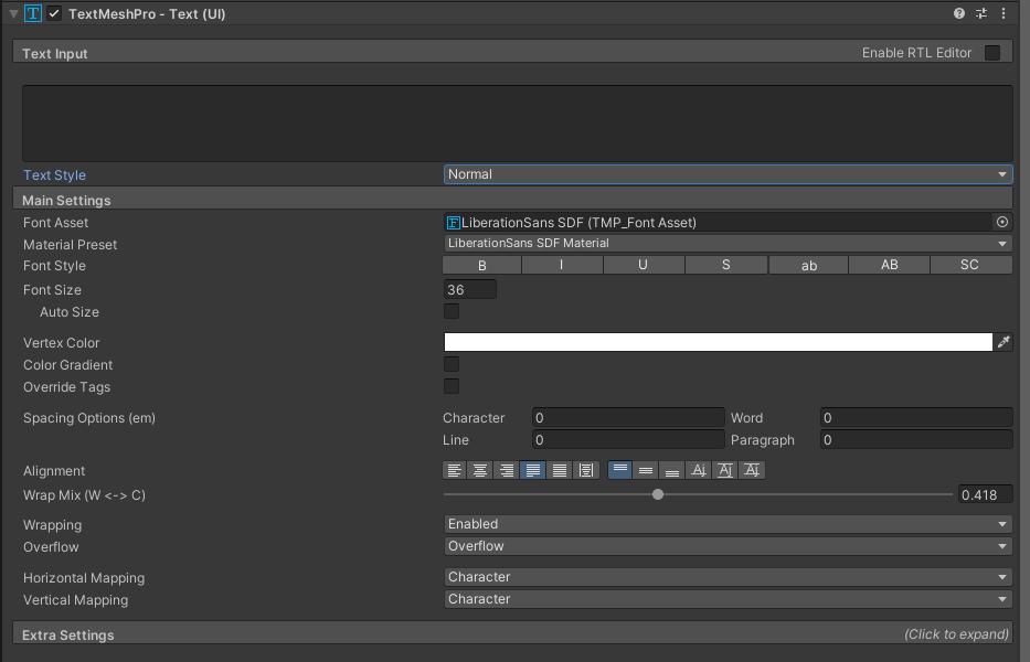
You can modify the way your text looks through the TextMeshPro component of each text element. You can change fonts, colors and default text size on top of other more advanced aspects.
Custom fonts
In order to use a custom font you will first need to import it into Unity and convert it into a font asset. For that you will need a .ttf font file you would normally use to install the font on your system. Drag this font file into your project. After that navigate to the window menu and select TextMeshPro>Font Asset Creator.
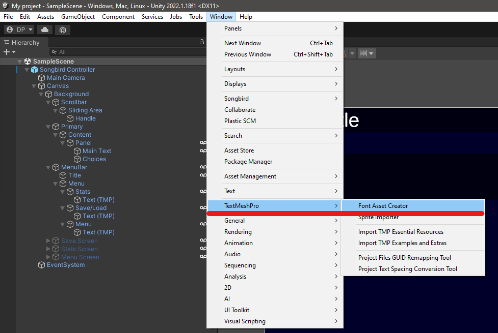
Then you will need to drag the font file into the creator Source Font File tab.
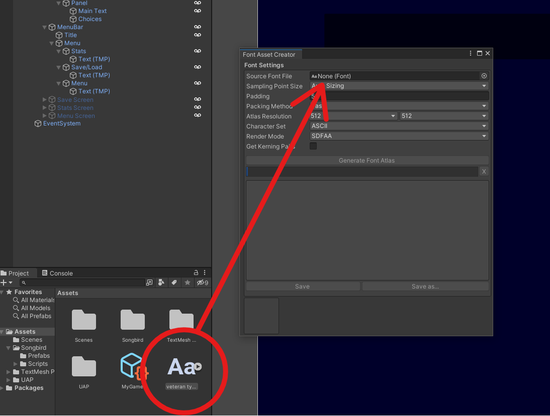
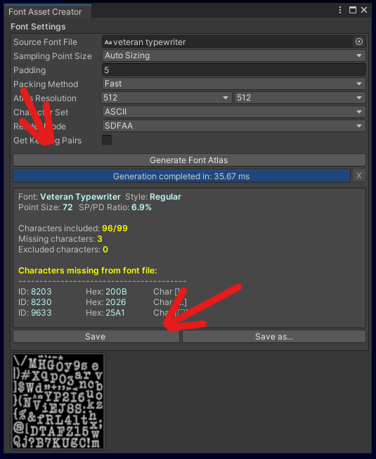
Optionally you can adjust settings like default padding and resolution. Once you're done press Generate Font Atlas. The window will generate a file and inform if some special characters didn't get imported due to incompatibility. Afterwards press save and select the location for your new font asset.
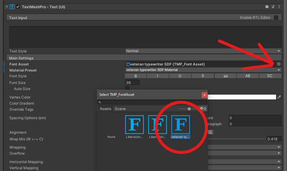
You can now close the creator and assign your new font by either dragging the font asset into the Font Asset tab or opening the tab and picking the asset from a list. Your font is now set and you can freely use the same asset for other text elements.

Font size and color
Note: With update 1.0 introducing themes the color section of this guide is now redundant as changing themes will overwrite any edits made to text color.
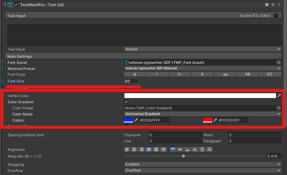
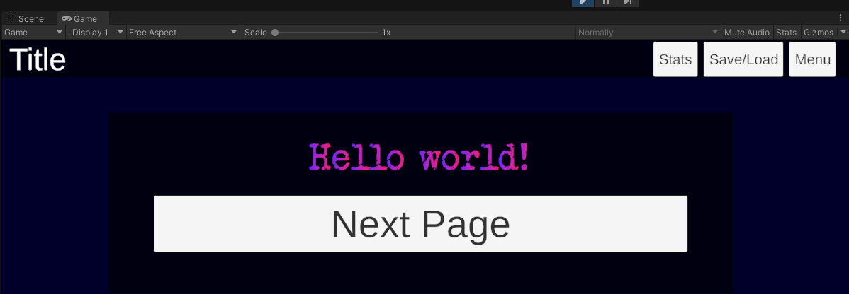
You can change the color and default size of your text by changing appropriate values in the component. You can set either a flat color or a gradient.
Note: Text inside the choice buttons always inherits its size from the main text, but won't inherit the color.
- Changing the background
Note: With update 0.4.1 now allowing for inserting custom backgrounds on a per page basis the first part of this section is redundant and won't be updated anymore, but will be kept as is just in case it's needed.
You can set a custom background color or even an image by modifying the Image component of Background element.
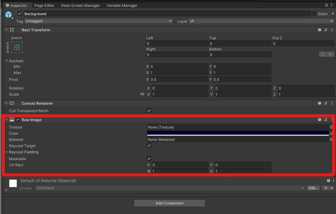
The color tab allows to set any flat color as your background. Alternatively you can add an image by dragging it into your project and then into the Texture tab. If you are using a custom texture remember to change the color to white unless you want to tint the background a specific color. The uploaded image will be stretched to fit your game window. To preview how the image will look on different aspect ratios you can use the aspect ratio menu at the top of your game window. By pressing + at the bottom of the list you can a custom resolution of aspect ratio to preview how the game will behave.
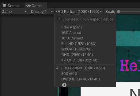
Here are some examples:
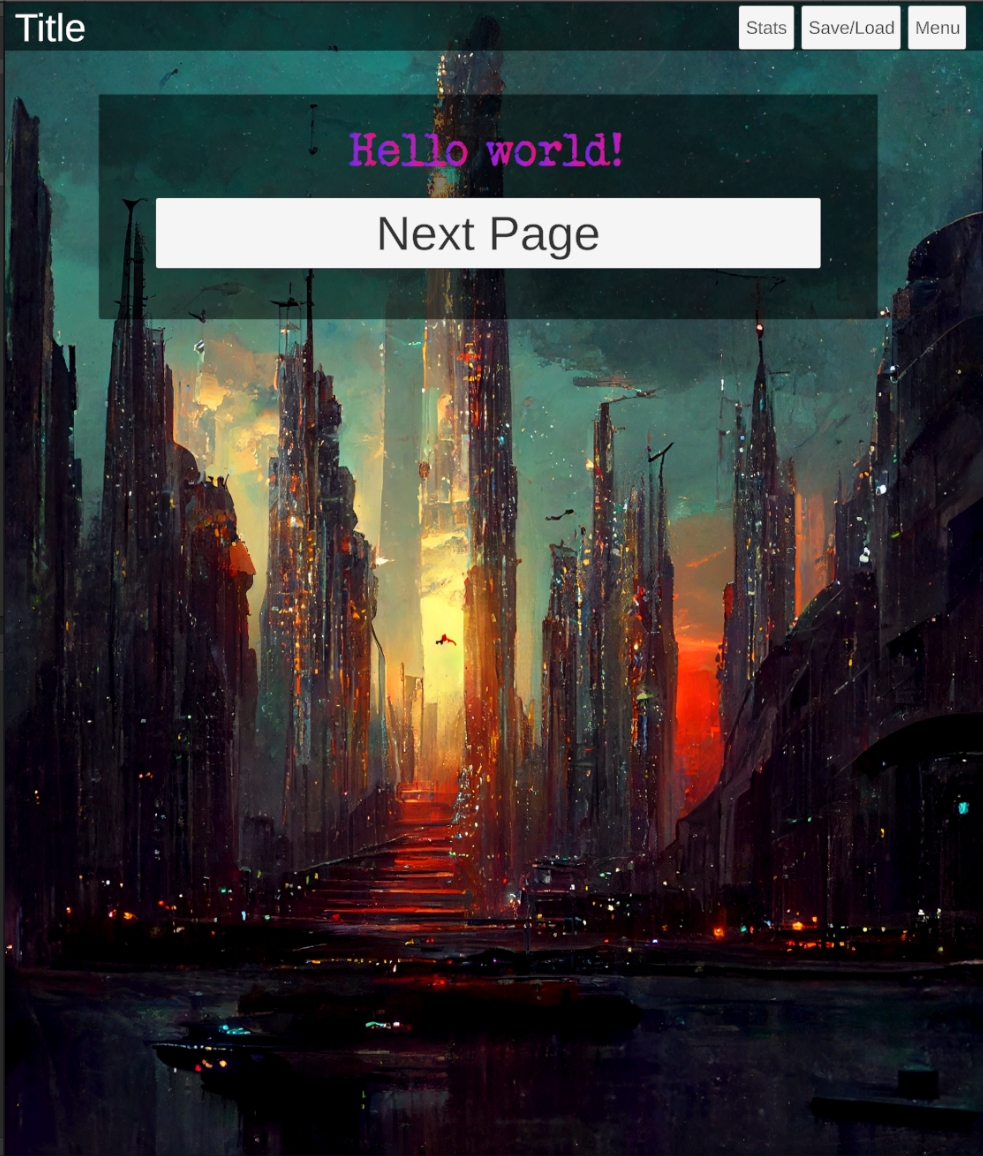
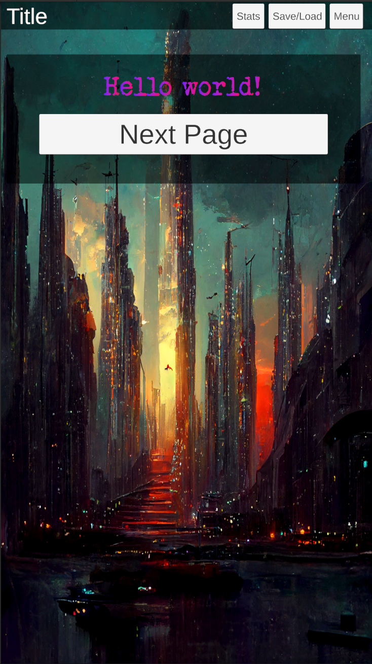
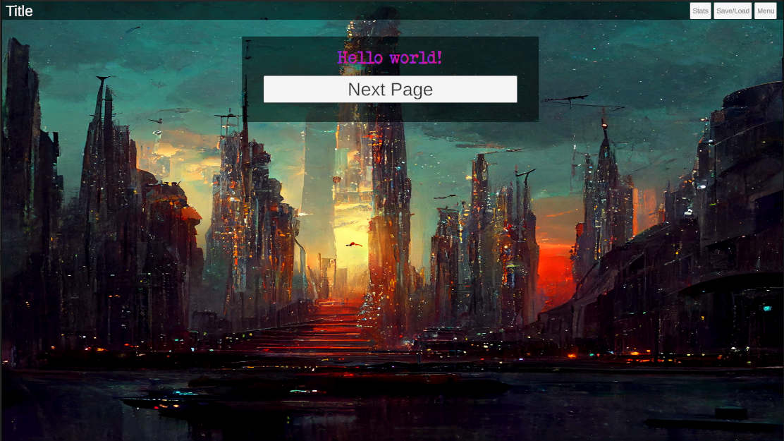
Songbird has two built in semi-transparent panels meant to help with text visibility. One for the menu bar at the top and one for the main content panel. Those can also be edited in the same way by altering the Image component of MenuBar and Content elements respectively. You can also hide them completely by setting the alpha value inside the color picker to 0. Disabling it is however not advised as it can make your text difficult to read, especially if you're using a custom font style and color. If you're making your text dark instead of light in tone then making the panel light is a good idea.
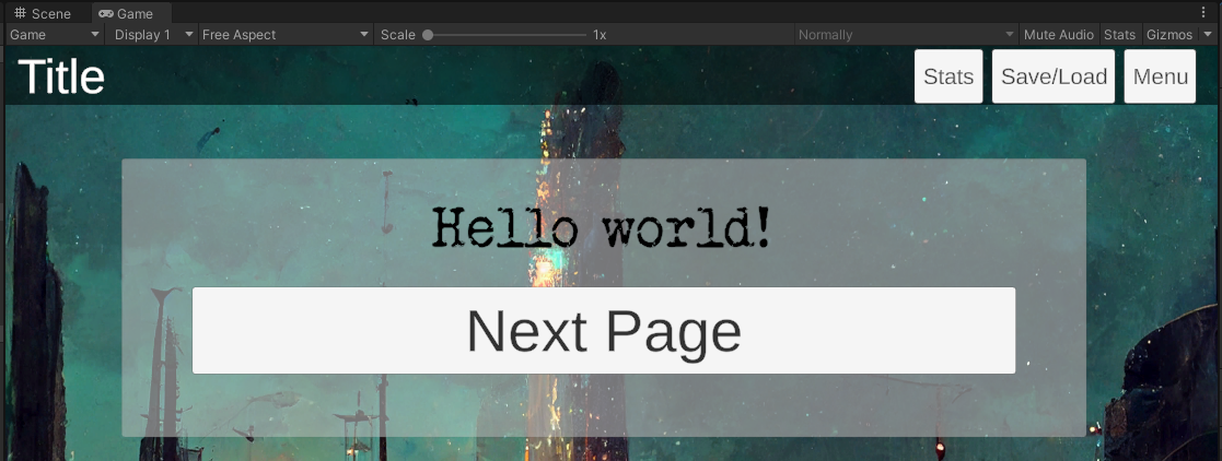
- Customizing buttons
Each button has two components you can use to alter the way it looks. The Image and Button components work together on making the button behave and look differently based on whether it's highlighted, pressed or selected.
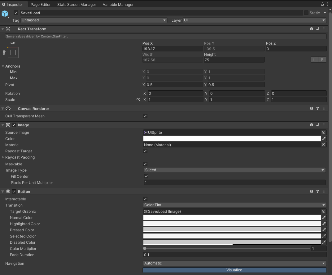
The Image component sets the default style of your button and it can be edited in the same way as your background. Parameters inside the Button component are responsible for all other behaviors and use the default state as a base.

You can change between different types of transitions for your buttons like Color Tint and Sprite swap to make your buttons stand out, but for interactive fiction it's often good practice to avoid overdoing it.
Additionally inside each button is a text element that displays the label for that button. You can edit that element to change the font, color etc.
Each button needs to be customized individually, but you can copy any changes you made to one button onto another. To do this you will need to copy the edited component and paste the changes into another. For this you need to open the component menu of the button you edited and press "Copy Component". Then open the component you want to paste onto, open the same menu and press "Paste Component Values". This method works for all components, but should be used carefully with text as it will also copy and paste the actual text inside.


Customizing choice buttons
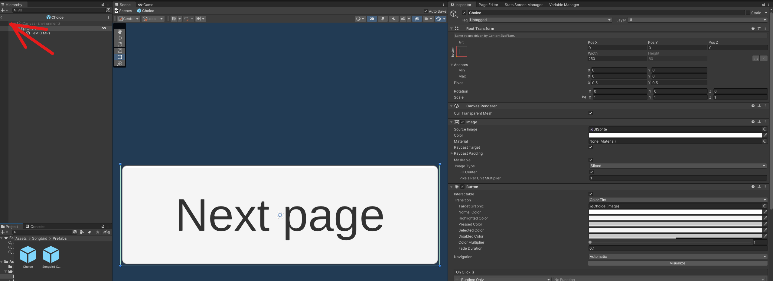
Choice buttons are the only element not found inside the controller. This is because each time a page is loaded in a new set of buttons is created for that page. To edit the look of those buttons you will instead need to modify the prefab used to generate those buttons. This prefab can be found in your Project window under Songbird>Prefabs and it's named "Choice".
To get full access and preview you will need to open the prefab in edit mode by double clicking it. In here you can make changes to both the button and its label. Keep in mind font size for choice labels is always inherited from main text when choices are loaded in. Once finished you can close the preview by pressing the back arrow at the top of Hierarchy window.
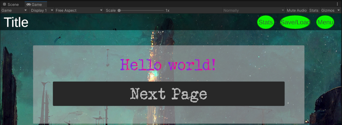
Note: To avoid having your customization wiped after updating you can create a copy of it and later use that backup to copy any customization back onto the prefab as explained above. To create a copy simply select the prefab and press Ctrl + D. This will duplicate the prefab right next to the original.
- Customizing pop up menus.
Each additional menu in Songbird is a separate element that's shown or hidden in game when an appropriate button is pressed. Their default state is hidden and to preview those menus you will first need to enable them inside the controller. To do this select the menu you want to edit and at the top of the inspector tick the box next to that menu's name. You can edit the menu without enabling it, but this will mean working blind unless you go into your game and check how your changes look there after making them.
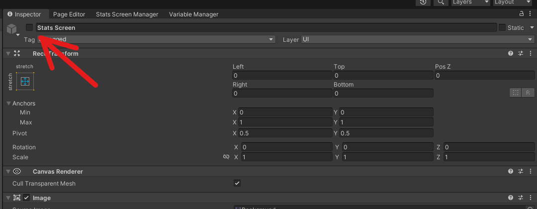
Once inside the menu you can edit all elements in the same way as with your main screen. After you're done remember to hide the menu as otherwise it will be visible when launching the game.
This concludes the visual customization guide for Songbird. If you have any questions or encounter errors feel free to mention them below. This guide will be edited over time to accommodate updates and received feedback.